The structure of a template
A RevasOS template has a structure designed to access classes in a precise and timely manner, so as to get the most out of the customization tools. In this guide you can discover how a template is structured and the logic of the different components.
Pages and layout
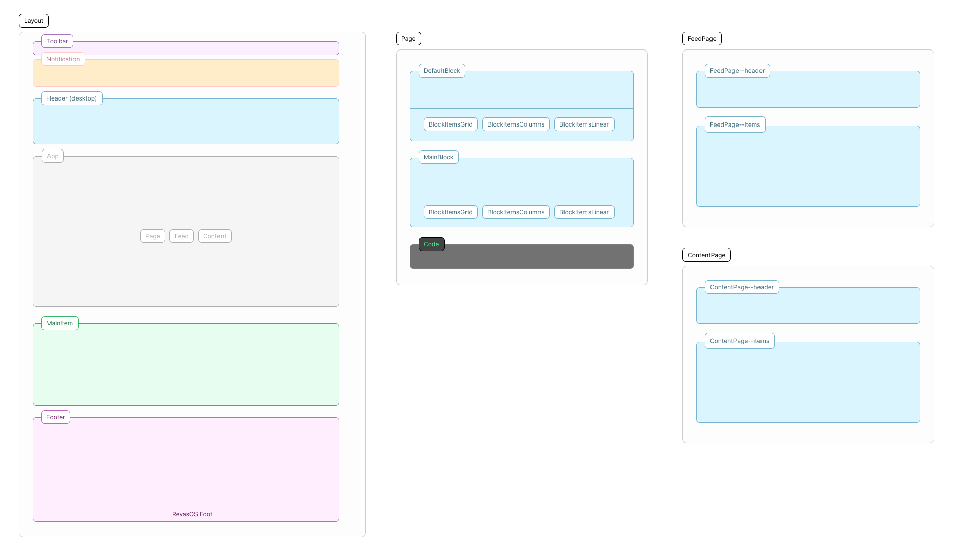
Each RevasOS website is made up of three types of pages:
- Web page, made up of blocks and subblocks,
- Feed page, to show blog posts,
- Feed content page, to show the content of a blog post.
In addition to the pages, a website has a layout, a structure that includes all the others and that contains elements that do not depend on the pages and that are characteristic of websites, such as the main link, navigation or the highlighted section.
These elements allow you to build a complete and high-performance website.
Elements
Layout
The layout is the shell that contains all the pages and presents a structure with the essential elements for the use of the website, such as:
- Logo
- Main action, the main link present throughout the site that represents the action that you want users to perform ("Sign up", "Contact us", "Log in", etc.)
- Notification, a section that is shown first, either as a pop-up or as a banner fixed at the top (at the discretion of the template),
- Navigation links, a series of links with which the user navigates the site,
- Featured section, a section always present at the end of the pages or as a suggested action at the end of a content,
- Secondary links and socials, a series of links that are not essential for navigation but still useful in site,
- Authors List, a list of authors with image, description and link,
- Toolbar, the bar that contains the accessibility settings and the language switcher.
Some of these elements in a template are collected inside more functional components:
- Header: contains the logo, navigation links, main action and presents the menu button to show the menu in mobile.
- Footer: contains the logo and authors, secondary links and socials.
Header, Notification and Toolbar
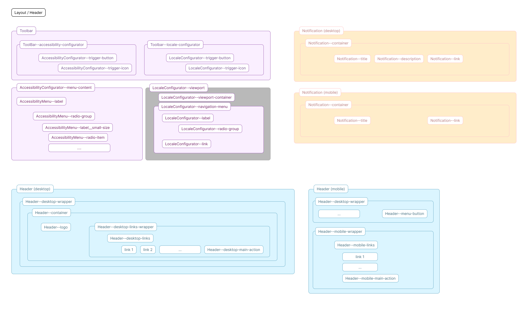
Header:
- class:
.Header - content:
- desktop: the wrapper (
.Header--desktop-wrapper) and the container (.Header--container) that define the internal layout, the logo (.Header--logo), the list of desktop links (.Header--desktop-links) in their wrapper (.Header--desktop-links-wrapper), the highlighted action (.Header--desktop-main-action) and, visible only on mobile, the mobile menu button (.Header--menu-button). - mobile: the wrapper (
.Header--mobile-wrapper), list of mobile links in their wrapper (.Header--mobile-wrapper) and the main action (.Header--mobile-main-action).
Notification:
- class:
.Notification - content: the container (
.Notification--container) that defines the internal layout, the title (.Notification--title), the description (.Notification--description) and the link (.Notification--link).
Notification:
- class:
.Toolbar - content: the two configurators (
.Toolbar--accessibility-configuratorand.Toolbar--locale-configurator), which contain the button (.AccessibilityConfigurator--trigger-buttonand.LocaleConfigurator--trigger-button) and its icon (.AccessibilityConfigurator--trigger-iconand.LocaleConfigurator--trigger-icon), and then the two panels for accessibility and for locale. - accessibility: presents a panel (
.AccessibilityConfigurator--menu-content) with a set of labels (.AccessibilityConfiguratorMenu--label) and groups of radio inputs (.AccessibilityConfiguratorMenu--radio-group) which in turn contain labels (.AccessibilityConfiguratorMenu--label__small-size) and the individual radio elements (.AccessibilityConfiguratorMenu--radio-item). - locale: presents a viewport (
.LocaleConfigurator--viewport) inside which there is the container (.LocaleConfigurator--viewport-container) and the navigation menu (.LocaleConfigurator--navigation-menu) - inside there is the label (.LocaleConfigurator--label), a series of links (.LocaleConfigurator--link) and a radio group (.LocaleConfigurator--radio-group).
App Body
Features:
- class:
.App - content: contains all pages and is inside the layout.
Footer and Featured Section
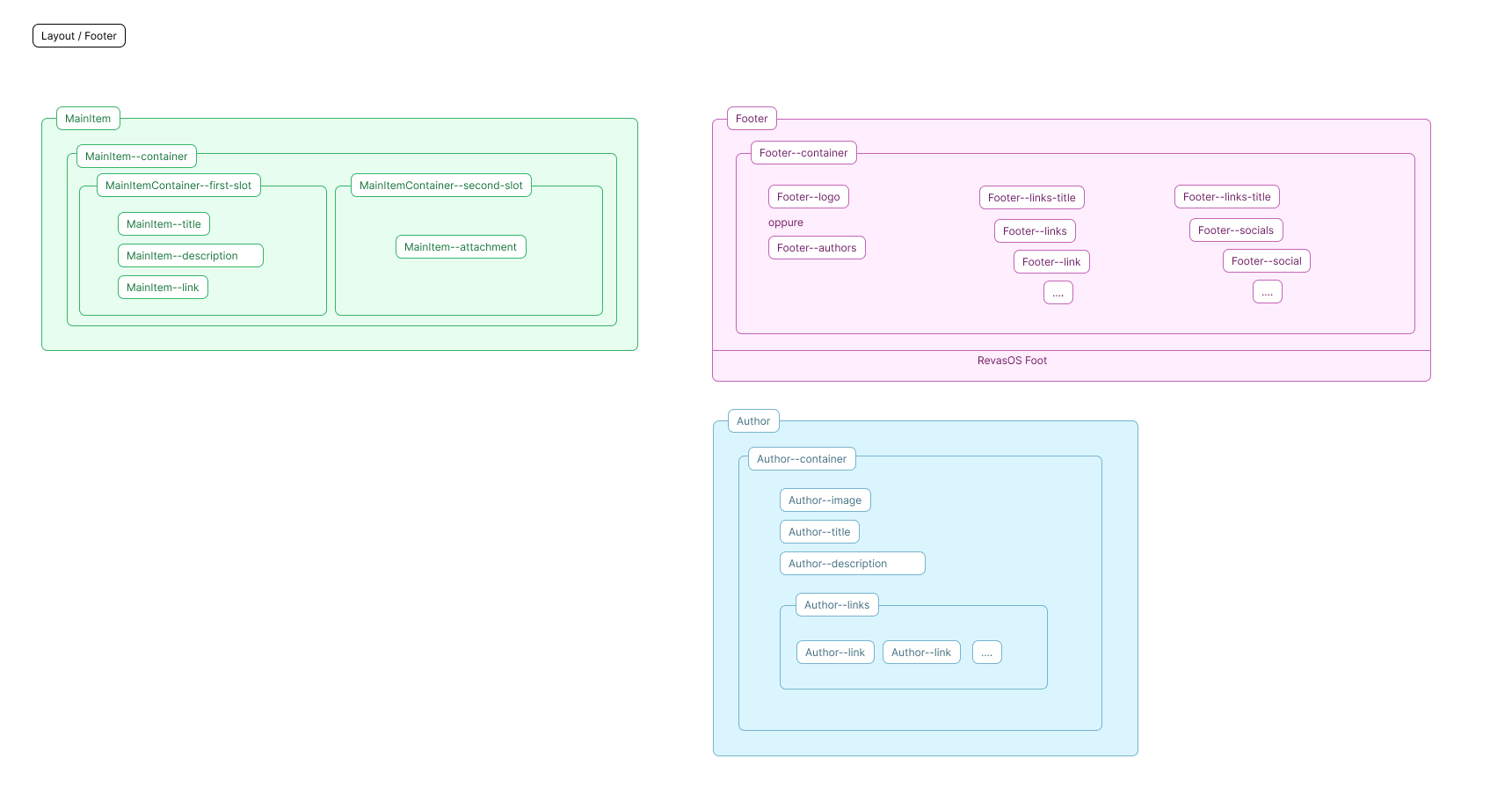
Featured Section:
- class:
.MainItem - content: the container that defines the internal layout (
.MainItem--container), a first slot (.MainItemContainer--first-slot) with the title (.MainItem--title), the description (.MainItem--description) and the link (.MainItem--link) and a second slot (.MainItemContainer--second-slot) with the attachment that can be video or image (.MainItem--attachment).
Footer:
- class:
.Footer - content: the container (
.Footer--container) that defines the internal layout, the logo (.Footer--logo), a section for authors (.Footer--authors), a section for links (.Footer--links) and one for socials (.Footer--socials) - each section has its own title (.Footer--links-title).
Author:
- class:
.Author - content: the container (
.Author--container) that defines the internal layout, the image (.Author--image), the title (.Author--title), the description (.Author--description) and a link line (.Author--links) with the individual links (.Author--link) inside.
Web Page
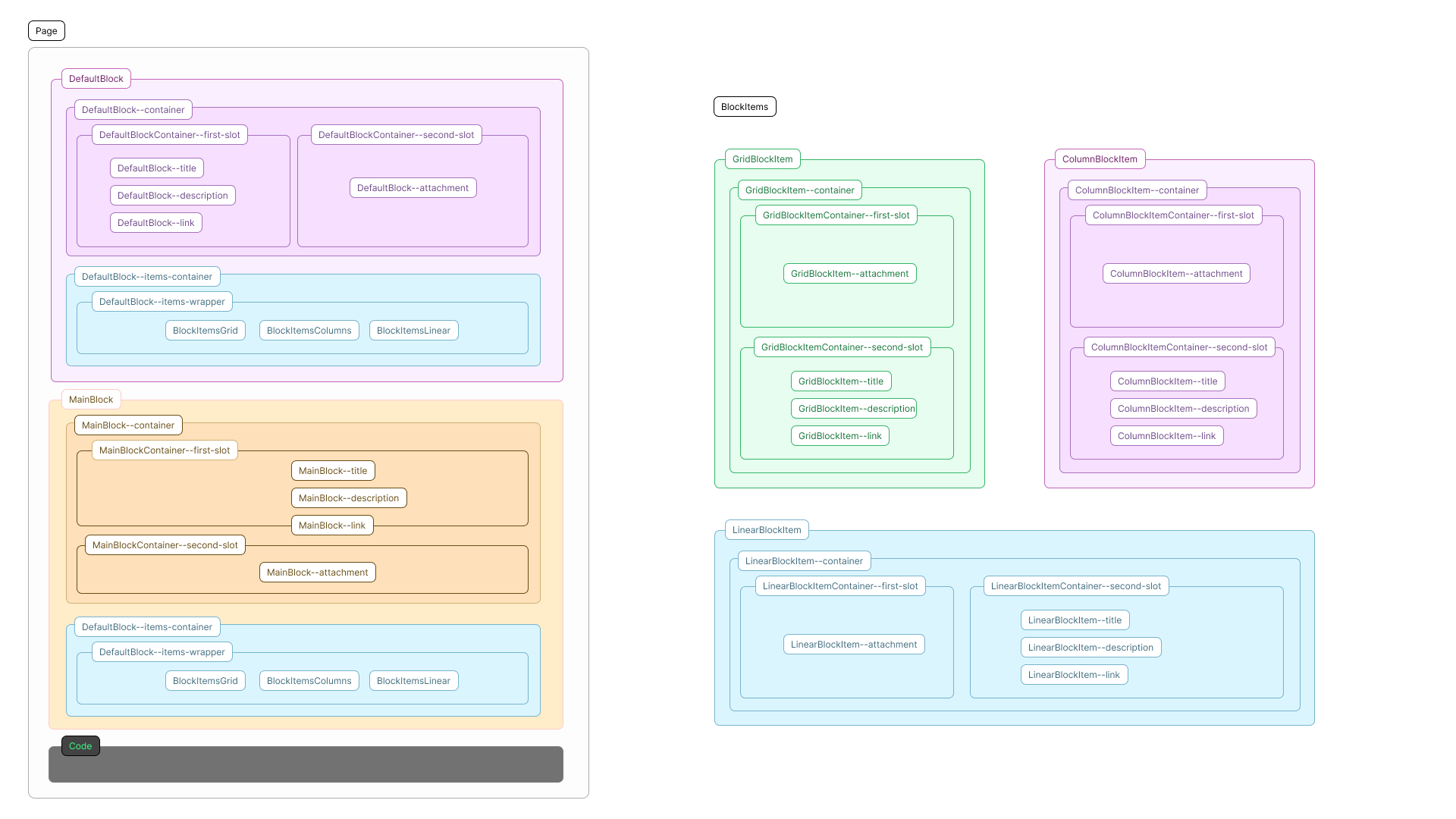
Features:
- class:
.Page - content: default blocks (
.DefaultBlock), main blocks (.MainBlock) and inline code injection. - url:
https://{domain}/{language}/{page-slug}
Blocks
Structure
- an external wrapper that contains the content container and the subblock and column container in case there are mosaic subblocks:
- default block:
DefaultBlock,DefaultBlock--container,DefaultBlock--items-container,DefaultBlock--columns-container, - main block:
MainBlock,MainBlock--container,MainBlock--items-container,MainBlock--columns-container
- default block:
- the content container always has a first slot for title, description and link and a second slot for the attachment (image or video):
- default block:
DefaultBlockContainer--first-slot,DefaultBlockContainer--second-slot,DefaultBlock--title,DefaultBlock--items-description,DefaultBlock--link,DefaultBlock--attachment, - main block:
MainBlockContainer--first-slot,MainBlockContainer--second-slot,MainBlock--title,MainBlock--items-description,MainBlock--link,MainBlock--attachment,
- default block:
- sub-element container contains wrappers except for mosaic/column sub-blocks:
- default block:
DefaultBlockContainer--items-wrapper - main block:
MainBlockContainer--items-wrapper
- default block:
- wrapper or container contains the layouts of the individual sub-block types.
Subblocks
Structure
- subelements are always contained within their own wrapper that manages their layout:
- grid:
BlockItemsGrid, - list:
BlockItemsLinear, - mosaic/columns:
BlockItemsColumnthat contains for each column a containerBlockItemsColumn--column,
- grid:
- each subblock always has a wrapper and a container with a first slot for the image/video and a second for the contents:
- grid:
GridBlockItem,GridBlockItem--containerGridBlockItemContainer--first-slot,GridBlockItemContainer--second-slot, - list:
LinearBlockItem,LinearBlockItem--containerLinearBlockItemContainer--first-slot,LinearBlockItemContainer--second-slot, - mosaic/columns:
ColumnsBlockItem,ColumnsBlockItem--containerColumnsBlockItemContainer--first-slot,ColumnsBlockItemContainer--second-slot,
- grid:
- every first slot of a subblock always has the attachment (photo or video):
- grid:
GridBlockItem--attachment, - list:
LinearBlockItem--attachment, - mosaic/columns:
ColumnsBlockItem--attachment
- grid:
- every second slot of a subblock always has title, description and link:
- grid:
GridBlockItem--title,GridBlockItem--description,GridBlockItem--link, - list:
LinearBlockItem--title,LinearBlockItem--description,LinearBlockItem--link, - mosaic/columns:
ColumnsBlockItem--title,ColumnsBlockItem--description,ColumnsBlockItem--link,
- grid:
Feed Page
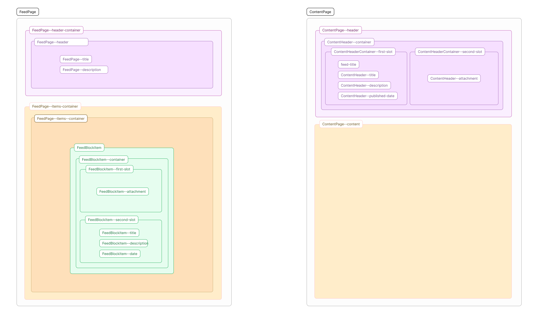
Features:
- class:
.FeedPage - content: the blog header (
.FeedPage--header-container) and all posts (.FeedPage--items-container). - url:
https://{domain}/{language}/-/{feed-slug}
Feed Header
Structure:
- class:
.FeedPage--header-container - content: the container (
.FeedPage--header) that defines the internal layout and contains the title (.FeedPage--title) and description (.FeedPage--description) - under the header is the container and the content grid wrapper.
Post Grid
Structure:
- class:
.FeedPage--items-container - content: the wrapper (
.FeedPage--items) and the individual cards of the posts structured as follows:- a wrapper and a container with a first slot for the image/video and a second for the contents:
FeedBlockItem,FeedBlockItem--containerFeedBlockItemContainer--first-slot,FeedBlockItemContainer--second-slot, - each first slot of a subblock always presents the attachment (photo or video):
FeedBlockItem--attachment, - each second slot of a subblock always presents the title, description and publication date:
FeedBlockItem--title,FeedBlockItem--description,FeedBlockItem--date,
- a wrapper and a container with a first slot for the image/video and a second for the contents:
Page of a content
Features:
- class:
.ContentPage - content: the content header (
.ContentPage--header) and the body text with formatting (.ContentPage--content). - url:
https://{domain}/{language}/-/{feed-slug}/{content-slug}
Content header
Features:
- class:
.ContentPage--header - content: the container that defines the internal layout (
.ContentHeader--container), a first slot (.ContentHeader--first-slot) with the title (.ContentHeader--title), the description (.ContentHeader--description), the link with the title of the feed it belongs to (.ContentHeader--feed-title), the publication date (.ContentHeader--published-date) and a second slot (.ContentHeader--second-slot) with the attachment that can be a video or an image (.ContentHeader--attachment).
Text body
Features:
- class:
.ContentPage--content - content: a series of HTML nodes with formatting defined by the
.ContentPage--contentclass